
5 High Yielding Asset Classes
A guest post from Dividendology


👋 Howdy Partner,
Today I’m sharing a guest post from my friend Dividendology.
He thinks a lot like I do, and he writes a great Newsletter, X account, and Youtube channel.
He wrote a great article about 5 high yield asset classes that I’m excited to share with you.
Enjoy the article below from Dividendology:
-TJ
Most people approach high yield investing the same way they play the old game minesweeper.
They start going around randomly clicking on squares, and maybe make a few lucky guesses-
But they are basically guaranteed to hit a mine eventually, ending their game.

Of course, if you know what to look for, you can strategically avoid the mines, and win the game.
This is a perfect metaphor for high yield investing.
🏆 Building a High Yield Portfolio
There are two major advantages to high yield investing most don’t take the time to acknowledge:
📝 Limited analyst coverage & market inefficiencies
Unlike the mega-cap S&P 500 names that have Wall Street analysts dissecting every detail, many high-yield alternatives trade with less attention. This lack of coverage often results in pricing inefficiencies and misvaluations, both on the upside and downside.🔍 Greater opportunity for diligent investors
For those willing to roll up their sleeves and learn the nuances of high yield asset classes (things like AFFO for REITs, NAV growth for BDCs, or option coverage ratios for Covered Call ETFs), there are chances to capture both yield and capital appreciation where the broader market overlooks it.
This is the beauty of high yield investing.
While there are certainly a multitude of risky investments out there, there are also some massive overlooked opportunities.
For example, a little over a year ago, I built an example high yield portfolio. (You can see and read about that portfolio here)
Our example high yield portfolio had the goal of providing a reliable yield of close to 8%, without seeing erosion of our net asset value.
At the time we analyzed our portfolio, the returns had been amazing.
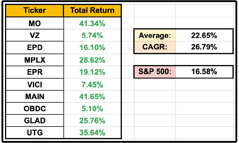
This portfolio actually outperformed the market!
But the performance doesn’t tell the whole story.
I ran a backtest on it for deeper insights.
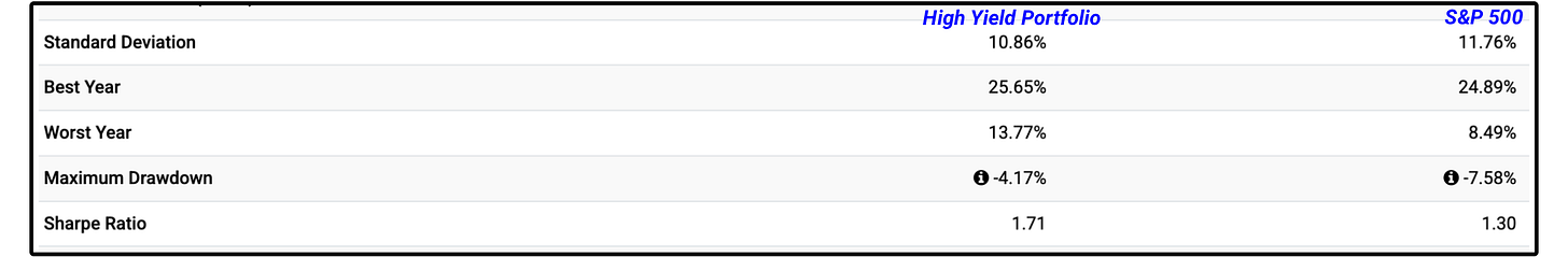
Not only did this portfolio outperform by a wide margin, but it:
Had lower volatility (standard deviation)
Had a lower maximum drawdown
Had a stronger Sharpe Ratio
The Sharpe Ratio is an important one.
The Sharpe Ratio is a way of measuring how much return you’re getting for every unit of risk you take.
Basically, this portfolio took on less risk than the S&P 500, while still experiencing better returns.
🎯 The Truth
High Yield Investing does NOT always equal high risk.
In reality, a stock or fund’s dividend yield tells us nothing about the sustainability of the dividend.
It’s always about the fundamentals.
The issue with this?
The vast majority of investors have no idea how to assess the dividend sustainability of high yielding assets.
Today, we will be reviewing the 5 major high yield asset classes, and how to analyze them for dividend sustainability
And at the end, I’ll be revealing exactly what our real money High Yield Portfolio on Dividendology.com actually looks like.
When I look at the high yield investing space, I see two major issues:
Lack of knowledge on how to analyze High Yield assets
Lack of data on these assets
Not only do investors not know how to analyze these assets, traditional softwares don’t provide the necessary data to analyze them.
Despite this I ran a poll last month asking if my subscribers owned any of these asset classes, and 77% of you said you did!
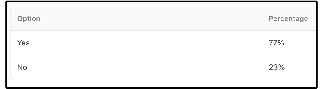
What was even more shocking were the results from when I asked if you had a general understanding of how to analyze the alternative income assets classes…
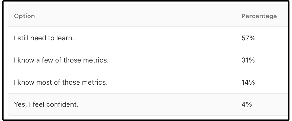
77% of the people who took the survey stated they owned these asset classes-
But only 4% felt confident in how to analyze the key metrics for these asset classes!
Today, we will be solving both of these problems.
There are 5 main asset classes that typically have high yields:
💰 Covered Call ETFs
🛢️ MLPs (Master Limited Partnerships)
🏢 REITs (Real Estate Investment Trusts)
💼 BDCs (Business Development Companies)
🧾 Preferred Shares
The way we analyze the dividend sustainability for each of them is different.
Let’s look at an example of each.
1. 💰 Covered Call ETFs
Example: ICAP - Infrastructure Capital Equity Income Fund ETF
ICAP currently yields 8.72%.
But many high-yield ETFs are just slowly liquidating themselves.
Here’s why that’s dangerous:
Shrinking Net Asset Value → fewer assets to write call options → lower premiums → dividend cuts
ICAP only writes options on around 30% - 40% of their portfolio.
Because of this, ICAP’s net asset value has held up well (and even grown), which tells us:
Its yield is more sustainable
It’s not eroding capital just to fund distributions
Softwares don’t provide data on things like portfolio options coverage and options moneyness, making covered call ETFs incredibly difficult to analyze.
This is why we built the Dividendology Covered Call ETF Database.
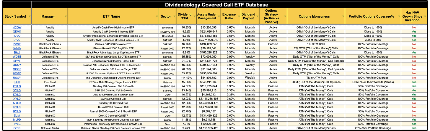
It provides data on things like:
Portfolio options coverage
Options moneyness
NAV since inception
If you’d like to access this database for free, you can do so here.
This provides us much of the information we need to assess dividend sustainability for covered call ETFs.
If you want to learn more about ICAP, you can do so here.
2. 🛢️ MLPs (Master Limited Partnerships)
Example: MPLX - MPLX LP Common Units
Have you heard of MPLX?
MPLX is a midstream energy partnership formed by Marathon Petroleum in 2012.
It operates pipelines, terminals, and storage across major U.S. basins, focusing on crude oil, refined products, natural gas, and NGLs.
MPLX generates stable cash flow through long-term, fee-based contracts.
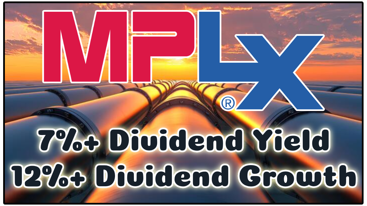
A few things you need to know about MPLX:
MPLX’s business model is highly defensive, generating stable, long-term contracted cash flows through its midstream operations.
These contracts provide strong insulation from commodity price volatility.
The balance sheet is solid, with a 3.4x leverage ratio and a BBB credit rating.
But what about the dividend?
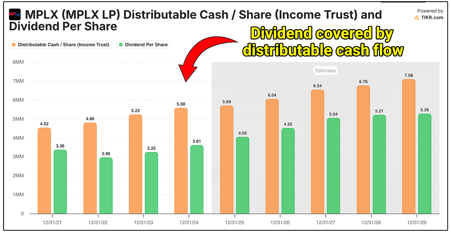
MPLX is currently yielding 7.36%
They have a 10 year dividend compounded annual growth rate of 8.77% (Wow!)
But how do we assess the dividend sustainability of MPLX and Master Limited Partnerships?
We look at the distributable cash flow (DCF) coverage ratio.
Formula: DCF Coverage Ratio = Distributable Cash Flow / Distributions Paid
What to look for:
>1.2x = Comfortable cushion
<1.0x = Red flag; they’re paying more than they generate
The MPLX dividend is well-covered by distributable cash flow, with a current coverage ratio of 1.5x
On top of this, management made this statement in a recent earnings report:
We see a period of time where 12.5% is very doable. It’s tough to give you an extremely long horizon, but we certainly are trying to convey to you that distribution growth at 12.5% has the potential...to be durable for a period of time.
Not only do they expect their large payouts to be sustainable, they expect to grow them at a 12.5% annual growth rate!
An amazing combination of yield with dividend growth.
3. 🏢 REITs (Real Estate Investment Trusts)
Example: O - Realty Income Corporation
Realty Income makes money by owning and leasing single-tenant, net-lease commercial properties to some of the strongest retailers and service businesses in the world.
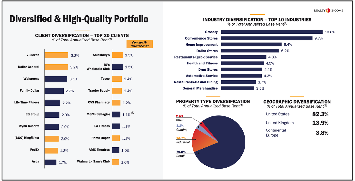
The company is known as “The Monthly Dividend Company” because it generates highly predictable rental income from long-term leases-
Most of which are triple-net leases, meaning tenants pay property taxes, insurance, and maintenance.
Here are a few key things to know about Realty Income:
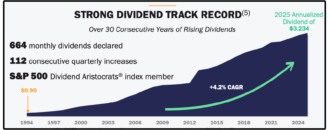
Realty Income has grown AFFO per share consistently over time, supported by disciplined acquisitions and contractual rent escalators
The majority of Realty Income’s debt is fixed-rate and long-dated, which significantly reduces interest-rate risk compared to many REIT peers
•The company currently yields 5.4%, with steady dividend growth of roughly 3–4% annually, supported by recurring cash flow
But how do we assess the dividend sustainability of Realty Income (and REITs in general)?
We don’t use the traditional payout ratio.
We don’t rely on free cash flow either.
Instead, we look at AFFO (Adjusted Funds From Operations).
AFFO is the REIT equivalent of free cash flow and is the best measure of how much cash is truly available to pay dividends.
Formula: AFFO Payout Ratio = Dividend per share ÷ AFFO per share
How to interpret AFFO payout ratios:
• Below 80% → Safe
• 80–90% → Occasionally Acceptable
• Above 90% → Riskier, less margin in downturns
We closely track historical AFFO payout ratios, as well as projected AFFO payout ratios in the Dividendology REIT Database.
Here is a small snippet from the database:
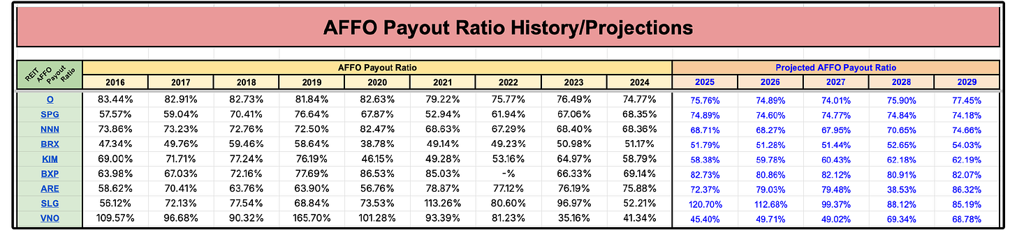
Realty Income currently has an AFFO payout ratio of roughly 75%, which places the dividend firmly in the safe and sustainable range.
4. 💼 BDCs (Business Development Companies)
Example: MAIN - Main Street Capital Corporation
Have you heard of MAIN?
Main Street Capital is a Business Development Company (BDC), which means they generate income by lending to small and mid-sized private businesses at high interest rates and collecting interest income, fees, and sometimes equity stakes in return.
Here’s a few things you need to know about MAIN:
Pays monthly dividends + frequent special dividends
Never decreased its regular monthly dividend
Many loans are floating-rate, so higher rates = higher income = more special dividends
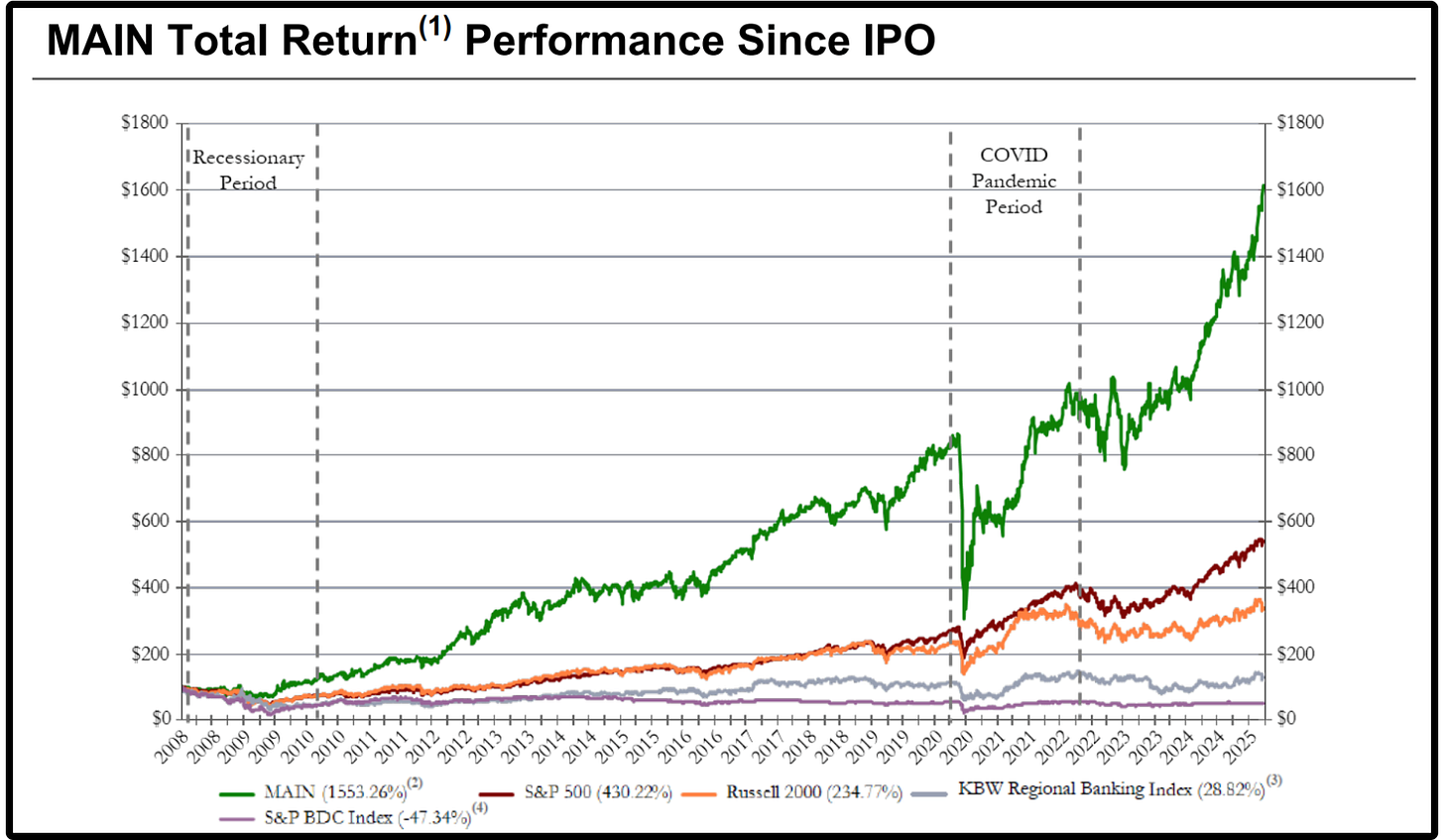
Since their IPO in 2008, they have had a total return of 1,553%, vs the S&P BDC index sitting at -47.34%.
MAIN currently has a dividend yield of around 7%, with a 3 year dividend growth rate of over 5%.
But how do we assess the dividend sustainability of MAIN and Business Development Companies?
Really, there are 3 things we have to consider:
Dividend Coverage Ratio
Formula: Dividend Coverage Ratio = Net Investment Income (NII) / Dividends Paid
Target:
>1.0x = Covered
<1.0x = Risky
MAIN has a dividend coverage ratio of 1.34
NAV Per Share
NAV (Net Asset Value) represents the per-share value of a BDC’s assets minus liabilities.
A BDC paying more in dividends than it earns can erode its NAV, which is a clear warning sign.
A rising NAV per share indicates that payouts are backed by real income, not unsustainable practices.
The strongest BDCs steadily grow NAV per share, which signals a sustainable dividend with the potential to grow.
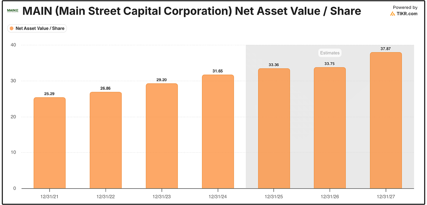
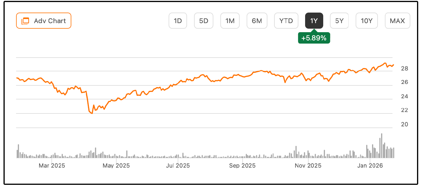
Main Street Capital recently reported they expect record net asset value per share for the eleventh consecutive quarter.
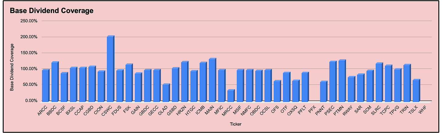
Base Dividend vs Total Dividend
As I’ve been building out the BDC Database, I’ve come to notice that nearly every single software lists the incorrect yield for BDCs.
Why is this?
Because BDCs technically have 2 yields:
Base Dividend Yield
Total Dividend Yield
The base yield is the yield we should (hypothetically) be guaranteed to get.
Anything above that is considered “special dividends” that depends on how much extra income a BDC is generating at the moment.
Here is Main Street Capital’s dividends paid, as well as special dividends in green.
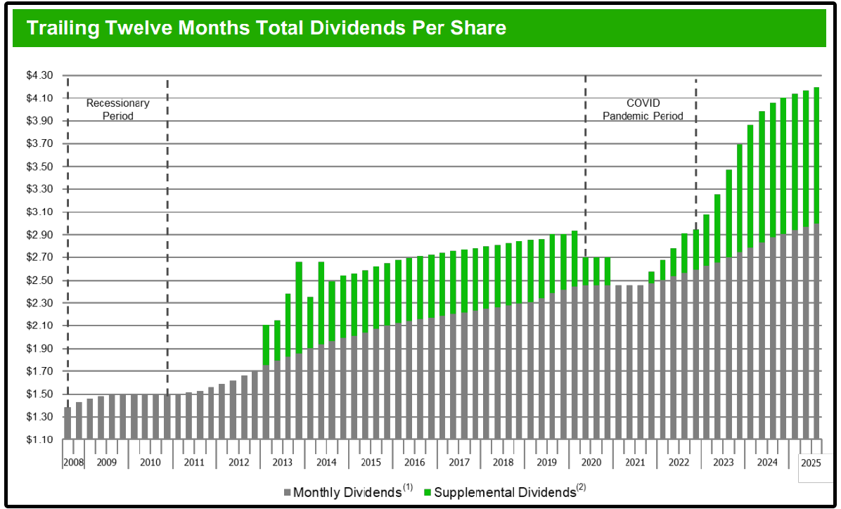
The base dividend coverage tells us how sustainable those base dividend payments are, NOT how sustainable the total dividends are
We track these metrics very closely with the Dividendology BDC Database.
5. 🧾 Preferred Shares
Example: PFFA - Virtus InfraCap U.S. Preferred Stock ETF
Have you heard of PFFA?
To be fair, I cheated on this one just a bit.
PFFA isn’t a preferred stock, but is an actively managed ETF that invests in U.S. preferred stocks.
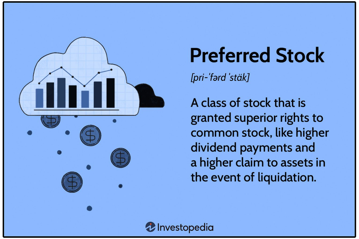
Here’s what you need to know about preferred shares:
They oftentimes offer way higher dividend yields compared to common stock
Preferred shares are higher in the capital stack than common stock but lower than debt (in a bankruptcy, debt holders are paid first, then preferred shareholders, then common shareholders)
They generally have less price volatility than common stock but offer limited upside.
And here’s what you need to know about PFFA:
The fund currently yields around 9.35%, with monthly income payouts
It invests primarily in preferred stocks from high-quality issuers, many of which are investment-grade.
As an ETF, it provides built-in diversification, which helps reduce the risk of any one issuer defaulting.
But how do we assess the dividend sustainability of PFFA and Preferred Shares?
Dividend sustainability for preferred shares isn’t too different from a typical stock.
Look for the dividend coverage (payout ratio) of the underlying holdings, the credit quality of the underlying stock, and look for the underlying holding to grow earnings and free cash flow.
Preferred stocks may not offer as much upside as common stocks, but funds like PFFA offer high, consistent yield with lower volatility.
💰 Know When & How to Pursue High Yield Investing
I love Dividend Growth investing.
But depending on your situation, it can sometimes make sense to pursue High Yield investing.
In the long term, Dividend Growth investing can generate more in dividends.
But in the short term, High Yield investing can generate far more income.
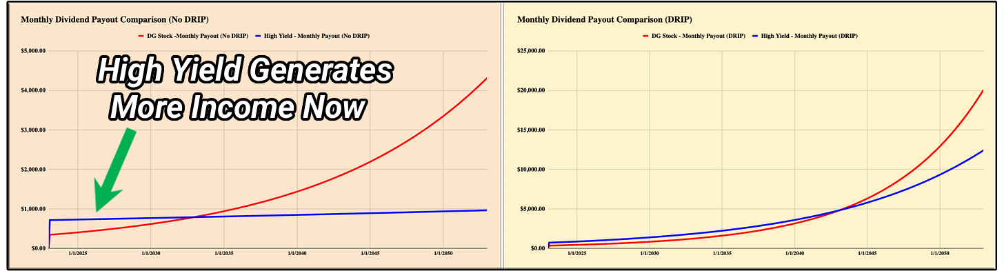
This sounds obvious, but have you ever thought about how powerful High Yield investing can be?
If you can achieve a sustainable yield of 8%, the amount of capital we would need to retire is cut in half. (based on the 4% rule).
We started building our real money High Yield Portfolio for members of Dividendology back in September of 2025.
So far, that portfolio has outperformed, while providing a sustainable yield of 8.61%!
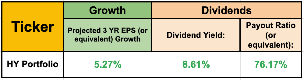
You can read more about our High Yield Portfolio here.
High Yield investing can be dangerous.
But when you know what to look for, it’s not only effective-
It can also be life changing.
Disclaimer
As a reader of Compounding Dividends, you agree with our disclaimer. You can read the full disclaimer here.
 | A guest post by
|
Thanks for letting me share!